If you played video games in the U.S. in the 1980s or 90s, you’re probably no stranger to bad box art. You’re probably thinking of some examples right now – images that are over-rendered, poorly composed, with characters that look nothing like anything you’ll find in the game. And usually those characters will be posed in ways that look unnatural or very uncomfortable. Not only that, the characters’ faces are usually either angry, or look arrogant, like they either inspired or were inspired by the Disney/Dreamworks trend of a character smirking with one eyebrow raised. This is all what marketing executives at the time thought would make a game stand out on a shelf, and appeal to kids. Either that, or they just didn’t care, so long as the game sold well enough to fund their cocaine habits.
Perhaps one of the more notorious examples of bad box art, is Mega Man. The first game looks as if an executive with little or no drawing ability scribbled a concept, then handed it off to an amateur painter. By the third game, the cover art would start to more closely resemble the the original Japanese designs, but Mega Man would still look cocky and over-rendered. And RIPPED.
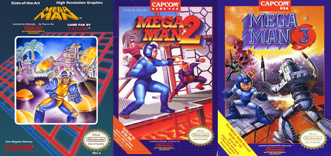
By contrast, the Japanese covers were bright, cartoony, and appealing –

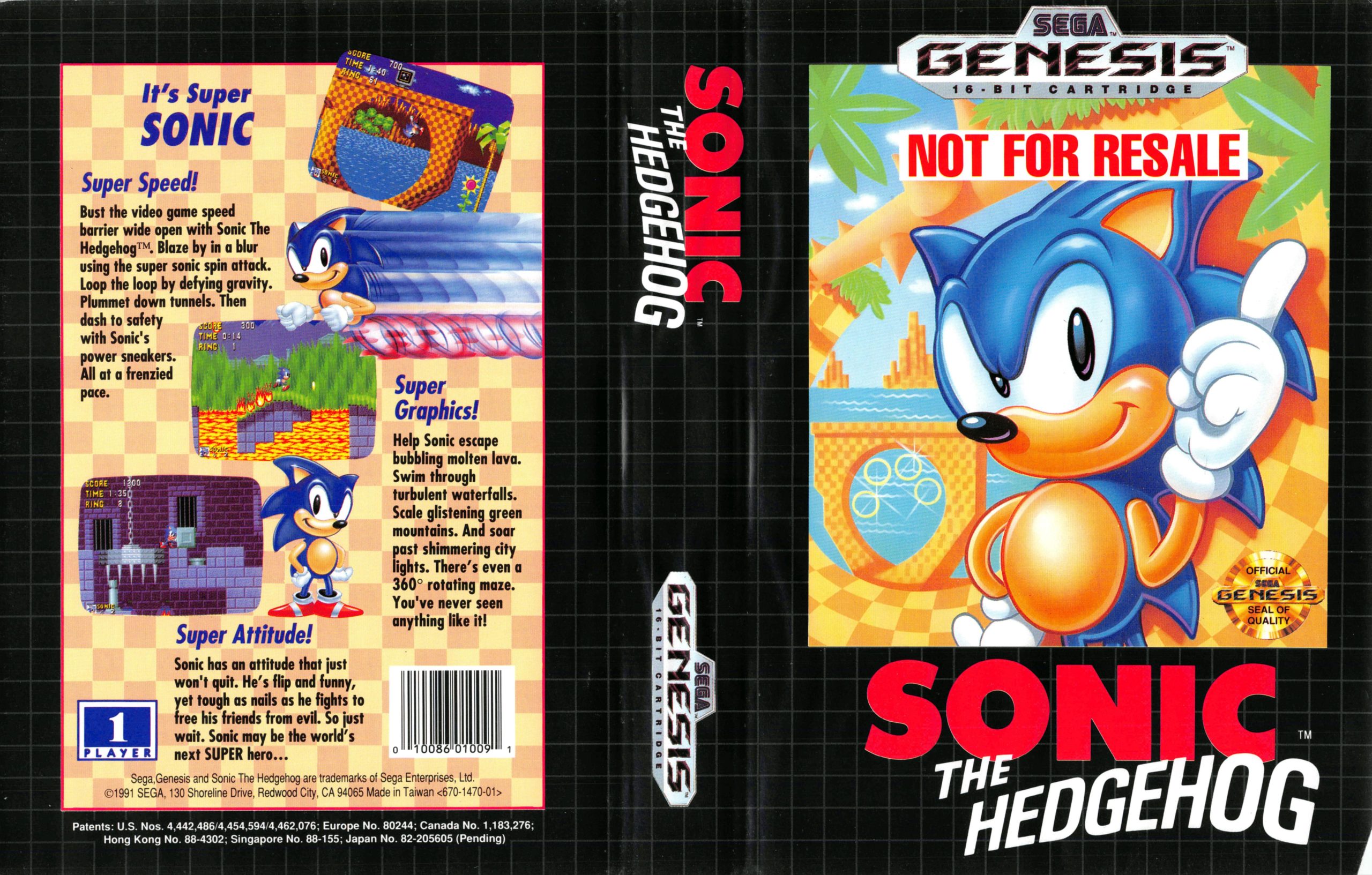
Over the past couple of years, I’ve start to collect games I used to own, and decided to make custom covers. It started with the Sonic the Hedgehog games. The cover art for the Sonic games in North America weren’t the worst, but they still suffered from the usual problems – over-rendered, mediocre posing, “attitude”, etc.. Granted, it fit Sega’s marketing campaign of Sonic being cooler/edgier than Mario, but something about the character always looked off.
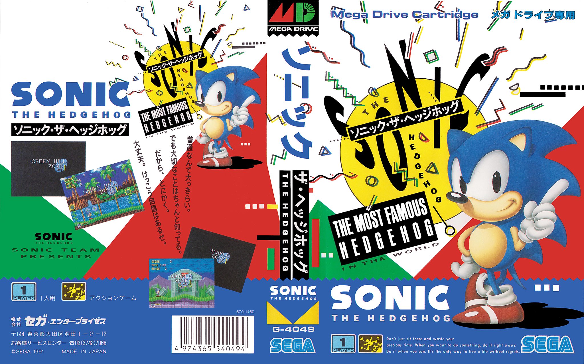
The Japanese cover was much simpler, by comparison, and yet busier at the same time.
Compared to the Japanese version, the American character art is just strange, to me. Sonic looks meaner, and his spikes are meant to look more like a mohawk, because ATTITUDE!
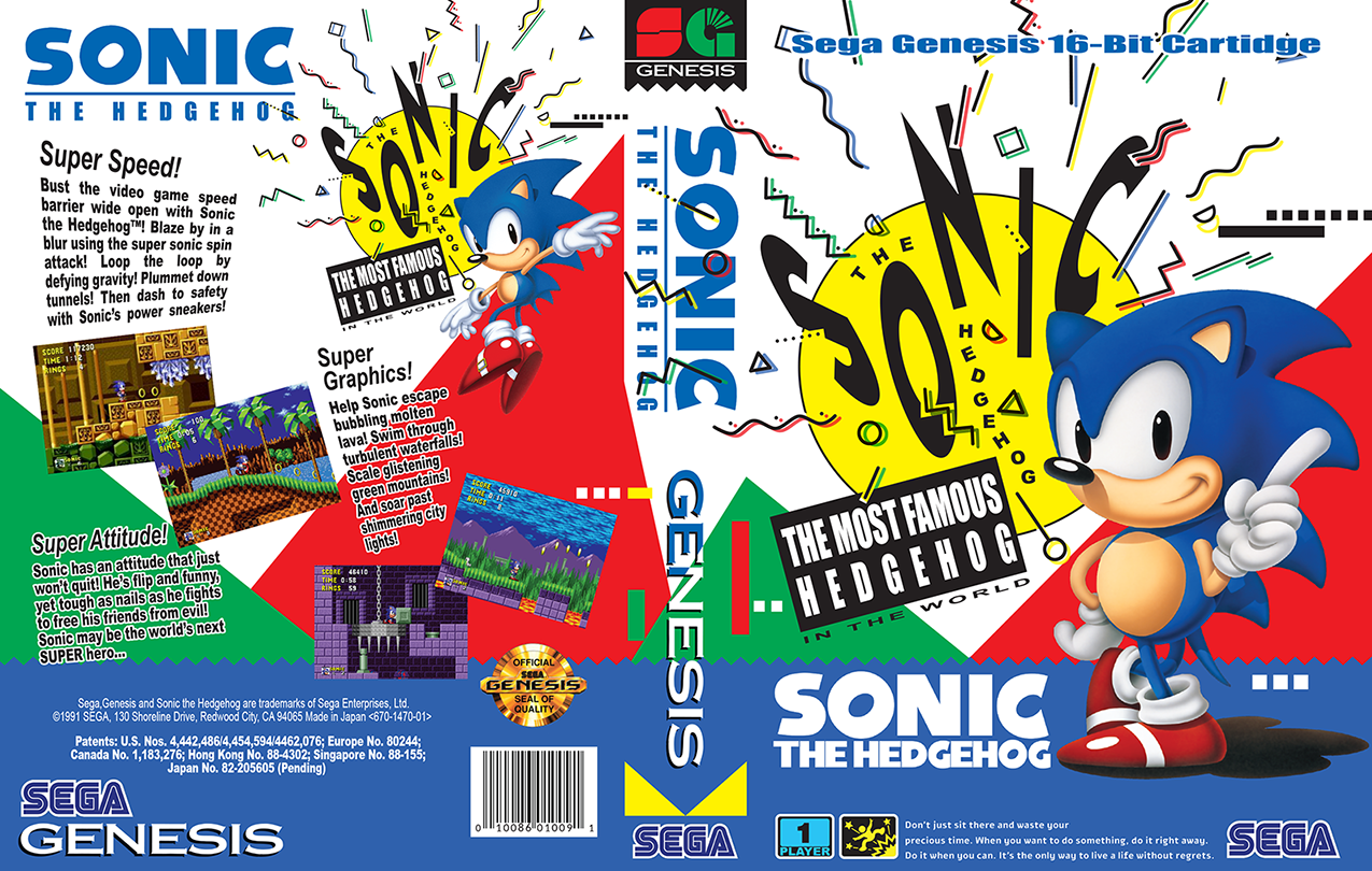
Since I find the Japanese cover to be much more appealing, I decided to copy it almost exactly –
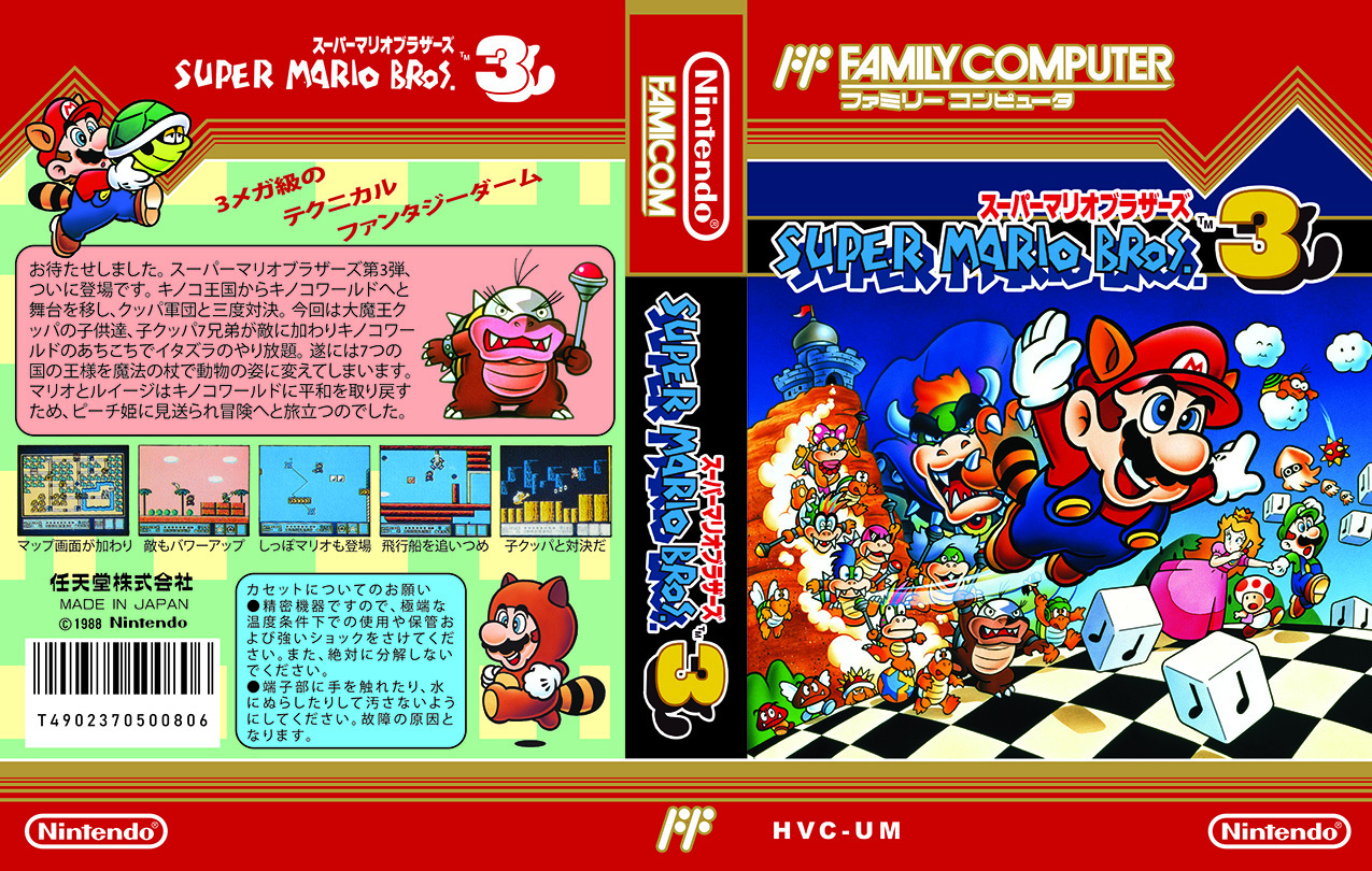
Once I was finished with my Sonic covers, I found others to work on. Visiting Japan in 2019, I picked up a few Famicom games for myself and my best friend, and figured those games could use covers as well. Famicom cartridges fit perfectly inside Sega Genesis game cases, but those cases are much bigger than the games’ original boxes. After adapting a Famicom template from The Cover Project, the first challenge was to find copies of the original art at a high enough resolution for printing. The second and perhaps bigger challenge, was finding clear enough pictures of the backs of the boxes, so I could scan the text with my phone. My goal was the make them look as authentic as possible.
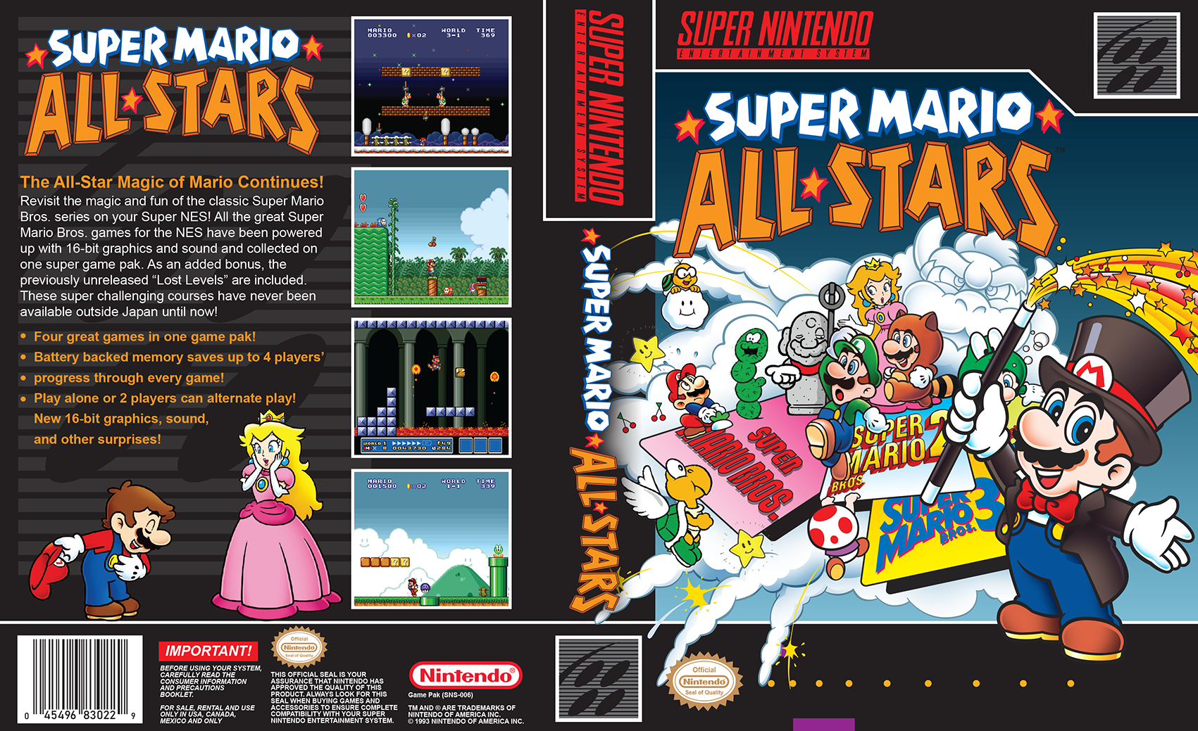
It didn’t take long for me to run out of Genesis & Famicom games to make covers for, so I turned my attention to the SNES. Probably the most difficult cover was Super Mario All-Stars.
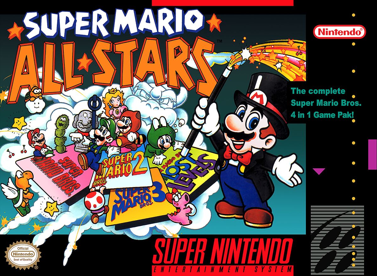
This is a rare case were I think the North American box art is better than the Japanese version, but there was no way to fit it to a portrait-style layout. I needed to be able rearrange the composition, but couldn’t find any high-resolution source art to work with. To get the cover I wanted, I needed to recreate a good portion of it, starting with magician-Mario and the Bowser cloud. Most of the other characters had existing art that I could use, although frog-Mario was another that needed to be recreated… only to barely be visible in my final cover.
It isn’t just the front of the box that needs to pop, in my opinion. Most SNES covers are styled after the original boxes, which means most of the them use black as their background color. No matter how colorful the game’s logo might be, the black background makes them blend together. No one game is going to draw your attention, unless you’re up close. But with a wider spectrum of colors, every game screams out for your attention, even from across the room!
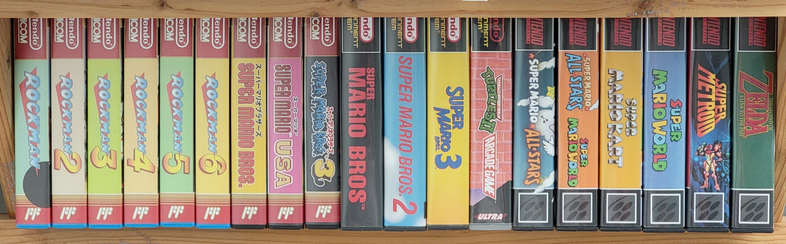
As I add more games to my collection, I’ll likely be making more covers as well. When they’re not being played, I want them all to look good on a shelf!
Check out some of my other covers below –
[ngg src=”galleries” ids=”2″ exclusions=”16,17,18,10″ sortorder=”16,17,18,10,6,12,11,9,8,13,14,7,15″ display=”basic_thumbnail” thumbnail_crop=”0″]