My VCR’s motor didn’t take much effort to fix. A little bit of super glue, some solder to bridge the traces, and by the next day it was working again! Better still, the dab of grease that’d gotten on the one copy of Metamorphoses didn’t have any impact on it, which was a huge relief.
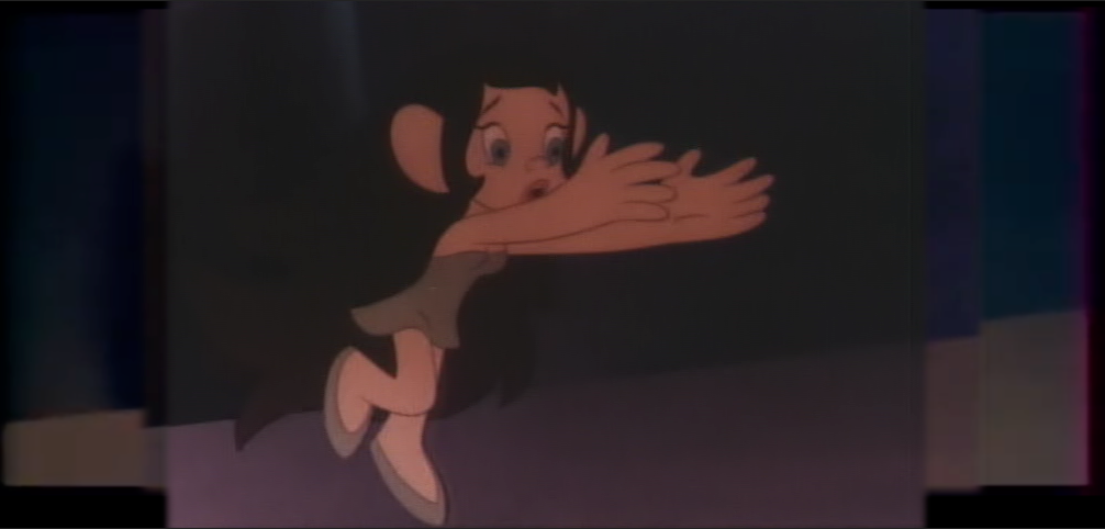
After capturing that one Metamorphoses tape, I ended up with more questions than I’d expected. It seems like every time I look at it, it has more surprises in store for me. A known problem may be due to the fact that I’m capturing it on a VCR that doesn’t support SECAM – periodically, the brightness will shift either up or down, then back again. What was surprising, this time, was that the brightness shift happens roughly every 3.5 seconds. It’s so precise that it has to mean something, but I don’t see much point in figuring it out. The important thing is that it’s not the tape – I’d captured it twice, and in both captures the shifts occur at different times.
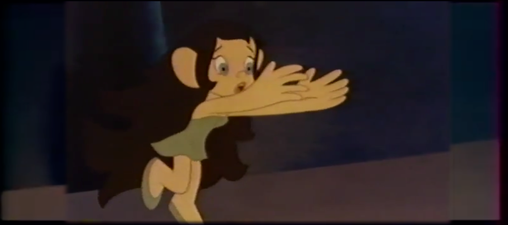
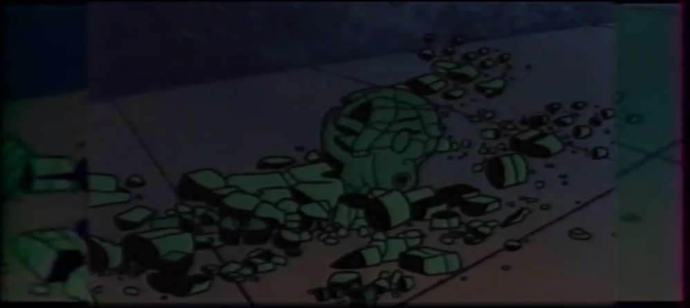
The biggest surprise was when I tried to de-interlace the video. That it’s interlaced at all is somewhat infuriating – I thought the standard method of transferring film to video in Europe was to speed it up from 24 frames per second to 25. In this case, though, it appears that the first 24 frames of every second are interwoven with the next frame, while the 25 frame is a whole repeated image. This is a somewhat easy fix – for the first 24 frames of every second, half the image just needs to be time-shifted.
…except that doesn’t actually improve the quality. Instead, what it reveals is that the film was apparently processed digitally, and its vertical resolution was cut in half before it was transferred to tape.
While the halved resolution is disappointing, at the very least it’s still much clearer than the copy I’d found on Youtube. And since my VCR can’t play back the tape in color, that Youtube video could still be useful – I could extract its color, and combine that with either or both of my captures… and that’s where I ran into another surprise – my copy and the one on Youtube are cropped slightly different.
I’d bought two copies of the film, just in case one of the tapes ended up being bad in any way. Now I wonder what I’ll find when I’m able to capture the other tape. Maybe it’ll be cropped like the Youtube version, or different still? Maybe it’ll even be full resolution!
For now, the captures I have may just be something to tinker with when I’ve nothing better to do. The raw signal from my VCR is either too weak or otherwise wrong for capturing with a Domesday Duplicator, and since this film’s resolution was halved, I’m not sure if there would be any benefit to using the Domesday. And even if I do use it, it may be quite a while before VHS-decode can process SECAM. The only other option I can think of is to find another VCR that does support SECAM, but the ones I’ve seen are expensive. And whether they work is another issue…
For several weeks, now, I’ve been playing a waiting game. First for my Metamorphoses VHS tapes to arrive at the go-between, and then for them to ship them to me. The VCRs to play them took more time. The only one of the two that worked wasn’t the most trustworthy, and couldn’t play the tapes in color, so I’d hoped to be able to fix the other deck. I’d thought I’d identified the problem, ordered replacement parts… and then waited another week for those to arrive, for that VCR to still not work.
Opting to use the other VCR instead, one reason it’s not trustworthy is that rewind & fast forward would cause its gears to slip, after which it also wouldn’t be able to eject the tape. No problem, I thought – I’d order a tape rewinder. Another week of waiting.
When the rewinder arrived and worked, I finally decided to order a Domesday Duplicator (DdD), after months of obsessing about it. After another week, the DdD arrived, and I used the included components to mod my laserdisc player. Modding the VCR would have required additional components, and I had more laserdiscs to back up than tapes, so it made sense to do the LD player first.
After getting the DdD set up, it was probably another week before I got any captures that would decode without errors. The short version is that Windows simply has too many processes running in the background, that interfere with the capture process. Switching to Ubuntu solved that.
Last night – a week after the DdD arrived – the components I needed to mod the VCR – which I’d ordered right after the DdD – were delivered. Modding the VCR was quicker & easier than the laserdisc player, but by the time I was finished, I wasn’t in any rush to test it. It was getting late, and I could wait until morning.
This morning I hooked everything up, and captured the first 3 minutes of one of the Metamorphoses tapes as a test. The VHS-Decode software didn’t want to work for my in Ubuntu, so I started to copy the capture file over to my Windows machine. Since I wasn’t likely to capture any more today, I went to eject the tape… only it wouldn’t budge. The whirring sound told me the VCR’s gears had slipped again, which meant I would need to very carefully take it apart, and wind the gears manually.
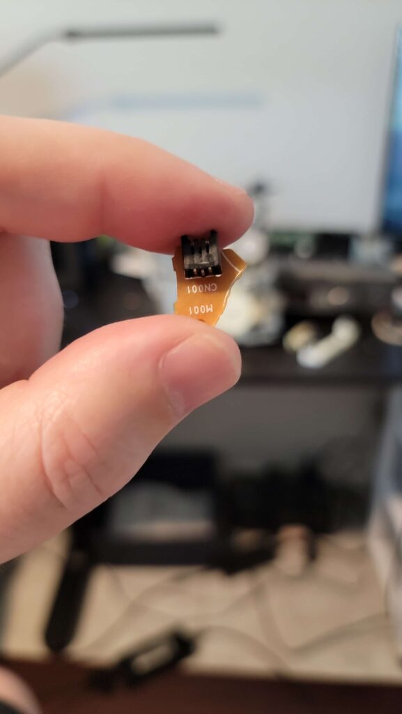
While I was attempting to move the gears, the cassette try sprang up. The back flap of the cassette didn’t close completely, but it may still have slightly damaged the tape. It was around this time that I’d also heard something hit the floor. I couldn’t see it without my glasses, so whatever it was would have to wait. Once the tape was finally wound back up and ejected, it looked as though a spot of grease had gotten onto the magnetic tape. So that tape may now be ruined. Attempting to clean the grease off may just damage it further, and playing it may smear the grease on the player’s head. Fortunately, I have another copy…
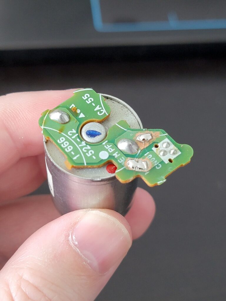
Playing any tapes any time soon may be out of the question. Once I’d put my glasses on, I’d found this piece on the floor –
Under my desk, I’d found the VCR’s capstan motor. That’s what had hit the floor. That piece in the picture is its power connector. Now, MAYBE I can reattach that piece with Gorilla Glue, and use some solder to bridge the connections. For now, though, I officially have two broken VCRs.
The cherry on top of this entire mess, might the test capture. The decoder in Windows produced NOTHING. Either there was no signal, or it was too weak to be captured. Adjusting the DdD’s physical gain might’ve helped, but it’s too late for that now.
If either of these VCRs cannot be repaired, then I’ll need to find another. Preferably one that fully supports SECAM, but those aren’t inexpensive.
Next week, I’m flying up to Michigan for the summer. I was hoping to have both Metamorphoses tapes captured before then, but now I may need to wait until I get back, in September or October…
Using a multimeter, I thought I’d located the source of the problem(s) with my Samsung VCR – a faulty regulator that would otherwise be supplying power to the drum & capstan motors. I’d ordered a replacement, waited a week for it to arrive this past Monday, promptly installed it… and the VCR still doesn’t work. Whatever the cause actually is, it seems it’s beyond my ability to find. I should have a professional look at it, but their services would probably cost far more than this VCR would ever be worth.
While the Samsung may be a lost cause, at least the Sony partially works. It won’t play my Metamorphoses tapes in color, but it WILL play them, and at this point I was willing to pop one of them in just to see what kind of quality I could expect. What I saw was… a bit surprising.
The jumps in brightness and occasional frame glitches had me extremely worried. Is it because the VCR doesn’t support the color signal? Could it be an issue with my capture device? As long as it’s not in the raw RF signal, this could be a non-issue once I have a Domesday Duplicator.
Another major concern is that the video is interlaced. De-interlacing it may be fairly simple, if my capture device and software hadn’t screwed up. It looks like the device may have converted the PAL signal from the VCR to NTSC, with a vertical resolution of 480i. OBS then stretched that 480i image back to 576i, making it impossible to de-interlace. Normally I would just try again, but the VCR can’t rewind.
I have a (hopefully working) tape rewinder on the way, but until it arrives I’m sort of stuck. I don’t want to use the second tape unless it’s with a Domesday Duplicator, and I don’t want to spend the money on one of those without being able to rewind the tapes.
Recently Metamorphoses/Winds of Change has caught my interest again, and I’ve gone… a bit crazy with it. For two months starting in late January, circumstances prevented me from focusing on much else, creatively, so I ended up fixating on this film.
At first, I was merely doing as I had done before – matching the American and French versions of the film to the Japanese DVD, frame by frame. But it began to bother me that the only sources for the American & French versions, were off of Youtube. I remedied this by purchasing a copy of the American VHS off of Ebay.
Color correction yet another aspect of my Metamorphoses/Winds of Change restoration attempt, that will be a bit of a challenge. While the Japanese DVD has the best video quality over all, some shots are just too dark. For the majority of the Perseus segment, I may end up using the just the VHS versions.
Japanese DVDAmerican & French VHS
DVDVHSDVDVHS
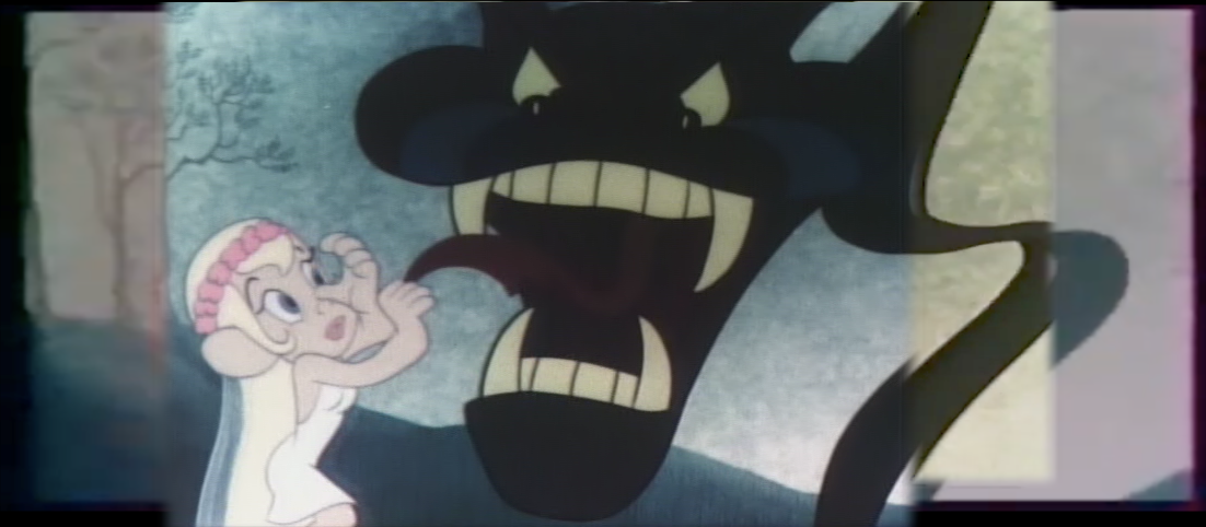
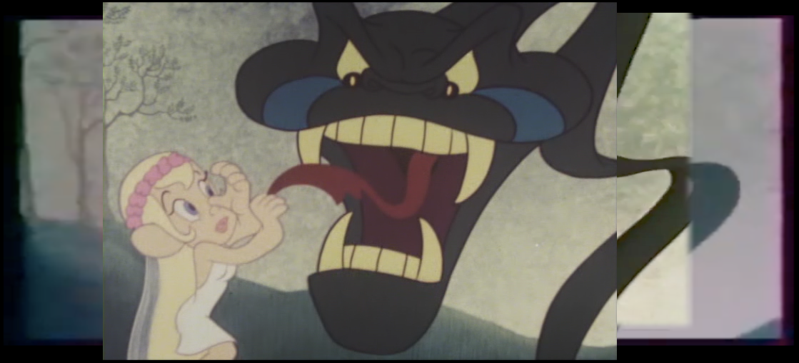
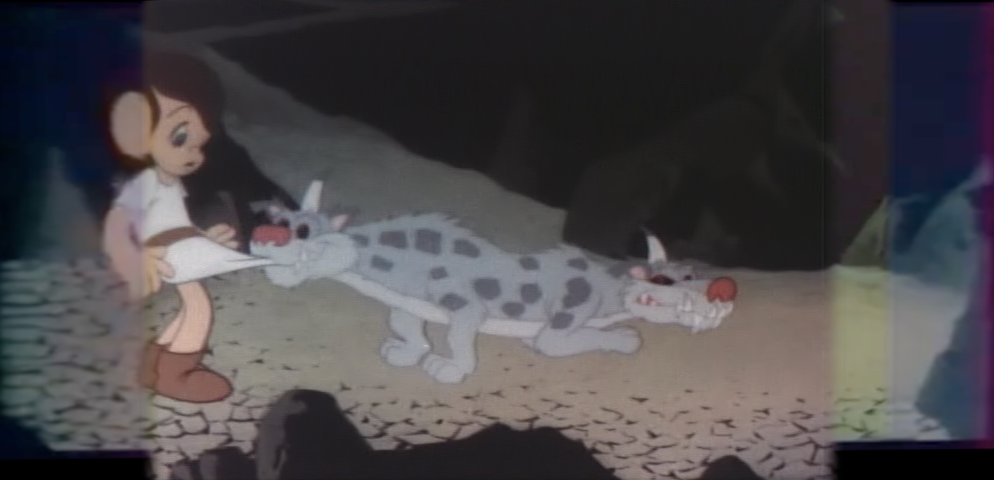
At the start of the Orpheus segment, the snake that abducts Eurydice is too dark throughout, and much of its detail is lost.
DVDtrailer
The ending of the House of Envy segment, when Aglauros turns to stone, is another scene where the Japanese transfer is too dark. It’s not too bad at the start, but it gets darker as she transforms.
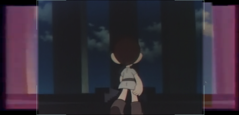
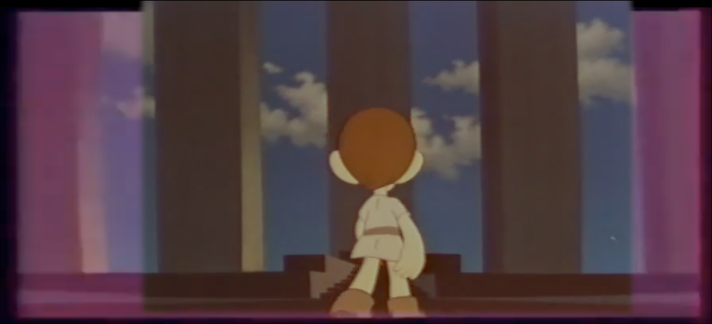
While attempting to reconstruct a wide-screen version of Metamorphoses/Winds of Change is challenging enough, it’s complicated further by having multiple versions to work with. The Japanese version is the highest quality over all, but the American VHS is framed differently, allowing for some parts of the extended frame to be clearer than the French version would otherwise allow. An added bonus is that the trailer on the Japanese DVD contains several wide-screen shots that were squeezed horizontally to a 4:3 ratio.
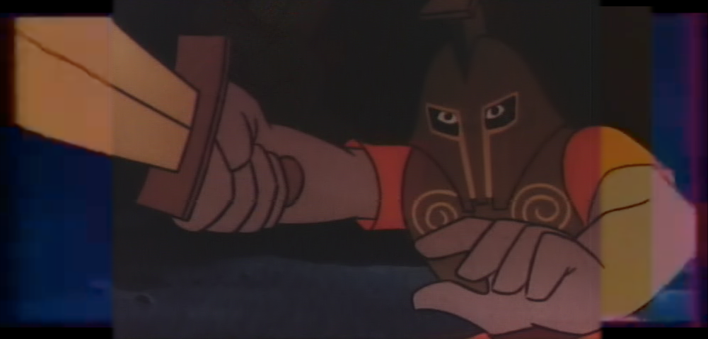
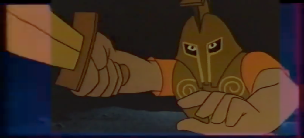
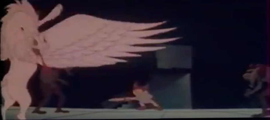
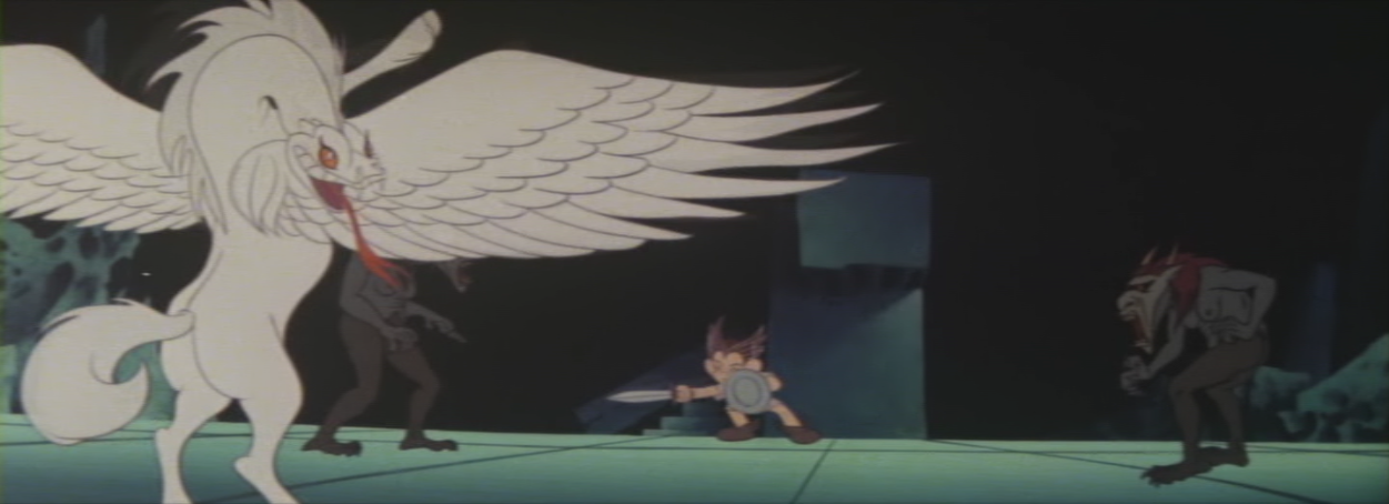
For much of the film, the wide format seems largely wasted, which makes the 4:3 home video framing less jarring. There are some shots, though, that must have been a challenge. One such shot is when Pegasus appears, at the end of the Perseus segment. In the American and Japanese versions, the gorgon on the right side of the screen is completely cropped out. This gorgon is technically visible in the French version, but is outside the “safe” area of the frame, meaning it may have been cropped out by TVs at the time. An issue with the American version is that it’s framed so that Perseus is in the center of the screen, which results in the viewer not being able to see Medusa’s severed head transforming into Pegasus.
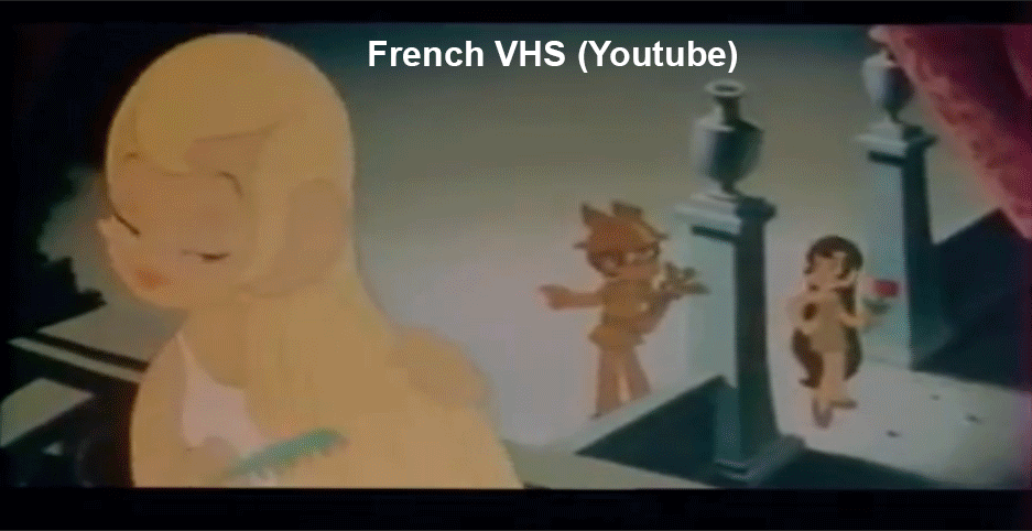
Japanese DVDAmerican VHSFrench VHSJapanese trailer
Overall, the framing of the different versions is a mixed bag. Sometimes, the American version will clear up an extra 10% of the picture. In few rare cases, it may add 25% or more. But for much of the film, it either only clears up the backgrounds, or aligns so closely to the Japanese version that it’s hardly worth the effort.
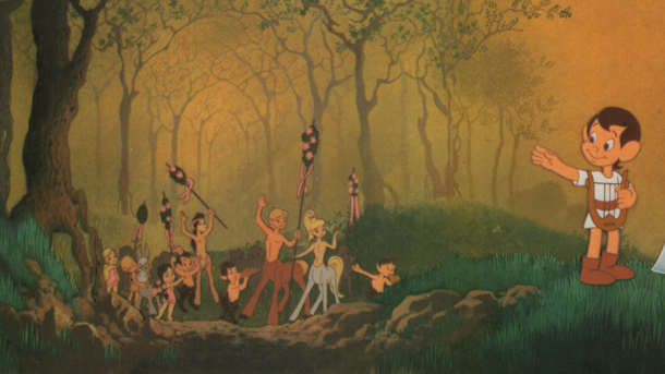
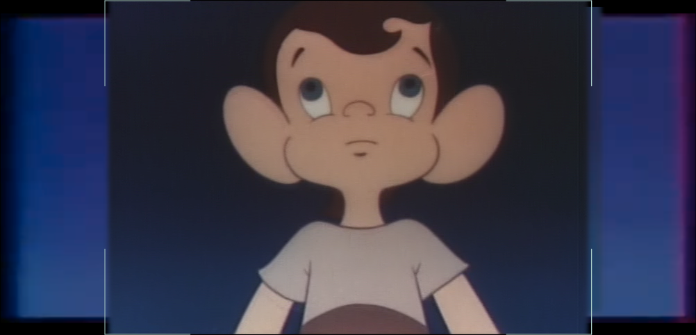
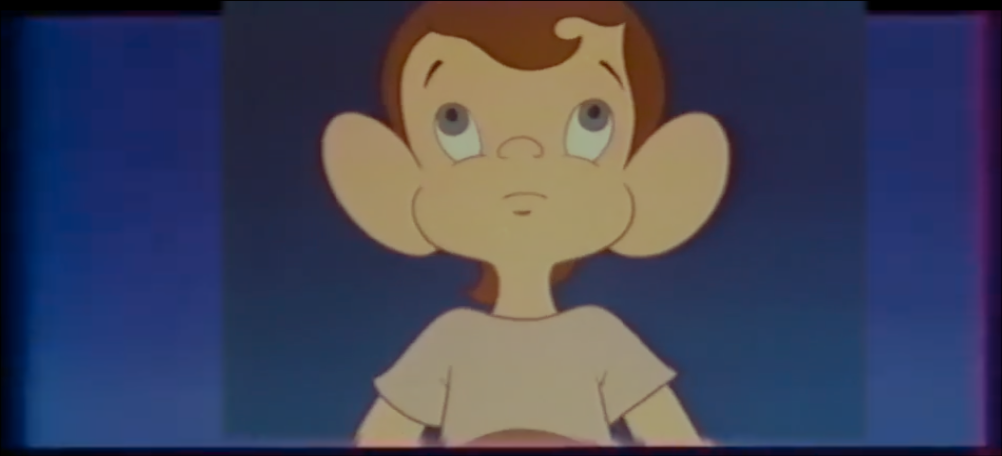
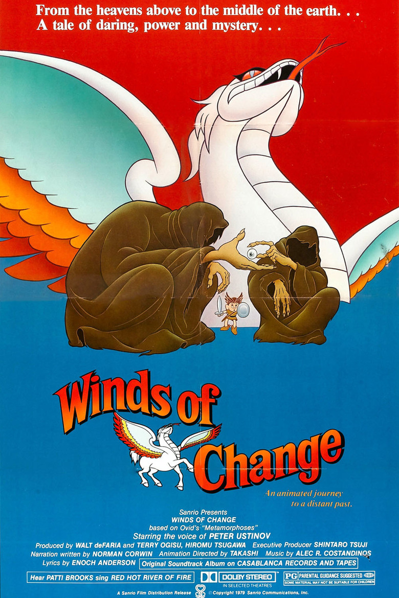
Sanrio’s Metamorphoses has been a resent interest/obsession of mine. Originally released in 1978, and envisioned as Fantasia for the rock era, the film was a flop. Critics and audiences complained that the music didn’t fit the visuals, the stories were difficult to follow without any narration or dialogue providing context, and, worst of all, many found it to be boring.
Sanrio wasn’t about to give up on the film, though – after cutting 7 minutes from its runtime, re-arranging its segments, adding narration by Peter Ustinov, and replacing the rock songs with a new disco soundtrack, the film was re-released as Winds of Change in 1979. And it flopped again.
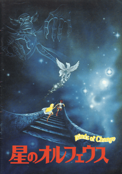
I, of course, knew none of the the film’s history until fairly recently. I’d grown up with the Winds of Change version on VHS, but it was one of those films that I watched over and over, but forgot about as I got older. Thinking back on it as an adult, I couldn’t even remember its name. But as luck would have it, by the time I’d identified it, it had been re-released on DVD! In Japan.
星のオルフェウ (Orpheus of the Stars)
Now having had the film on DVD for nearly 20 years, you would think that would be the end of it. I have it, and even if I didn’t, I could watch it in full on Youtube. So what more is there to think about? Well for one thing, there’s those 7 minutes of footage that was cut from the original version. That’s… a lot. What was cut, and why? How was the original music?
And then there’s the fact that the theatrical release was wide-screen, with an aspect ration of at lease 2.35:1, while the home releases were cropped to 1.33:1. That’s quite a lot of visual information to lose. Unfortunately, it’s one of those things that I’ll never be able to know. Unless Sanrio decides to re-release the film with a new, wide-screen transfer, all I can do is wonder about what it once was.
…and then I happened upon the French version.
While the video quality of this version of the film is not great, I was excited to see that it’s letterboxed. Very quickly, I had the idea of combining this with the Japanese DVD, using it to fill out the frame and restore some of its original wide-screen presentation. How hard could it be?
…even harder than one might expect, actually.
One detail I’d learned after starting this obsessive little endeavor, is that Hoshi no Orpheus is a different cut than Winds of Change. Its segments were restored to their original order, and the film runs 5 minutes longer. This adds quite a bit back in, but at the same time, there are small bits from the Winds version that were removed, while other shots are repeated. By combining the two versions, the runtime could be even closer to the original!
Now there’s just the tiny problem of needing to match each of the film’s segments frame-by-frame, and having to correct the lens distortion on the French version. I don’t even want to think about what to do about the music or narration, if I ever finish the visuals. As far as I’m aware, the Rolling Stones’ Criss Cross, is the only song from Metamorphoses that is now available in any form.
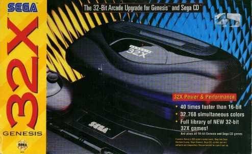
Sega’s 32X could be described in many ways, hardly any of them positive – unnecessary, a wasted opportunity, a mistake, a desperate cash-grab…
For me, in hind sight, the addon was something of a betrayal. Promises were made, expectations built up, that ultimately never panned out.
1994 was a wild year for gaming. Coverage of the then-upcoming 32-bit systems dominated gaming publications. Sonic 3 debuted early in the year, followed by Sonic & Knuckles 8 months later. Super Metroid landed in Spring, while Autumn saw the release of Mortal Kombat II for home consoles.
It was an especially big year for Street Fighter fans – Super Street Fighter II arrived on the SNES and Genesis in July, several months after the Turbo edition had made its debut in Arcades. Super Street Fighter II Turbo would then get a home release for the 3DO in November, pissing off all but the two Street Fighter fans whose parents could actually afford a 3DO. Summer also saw the release of the animated Street Fighter II Movie in Japan, while the U.S. got its own live-action Street Fighter film in December. And in July, Darkstalkers made its arcade debut.
In between the year’s game releases, the next generation of consoles loomed. Every month brought new details of not one, but two new systems from Sega, as well as Sony’s upstart Playstation. The 32X was especially promising for anyone who’d already had the Genesis, as it was hinted – if not officially claimed by Sega of America representatives – that the addon would serve as an upgrade to transform a Genesis and Sega CD into a Sega Saturn. Even if that had been the intent early on, that it never came to be would be just one of the system’s many disappointments.
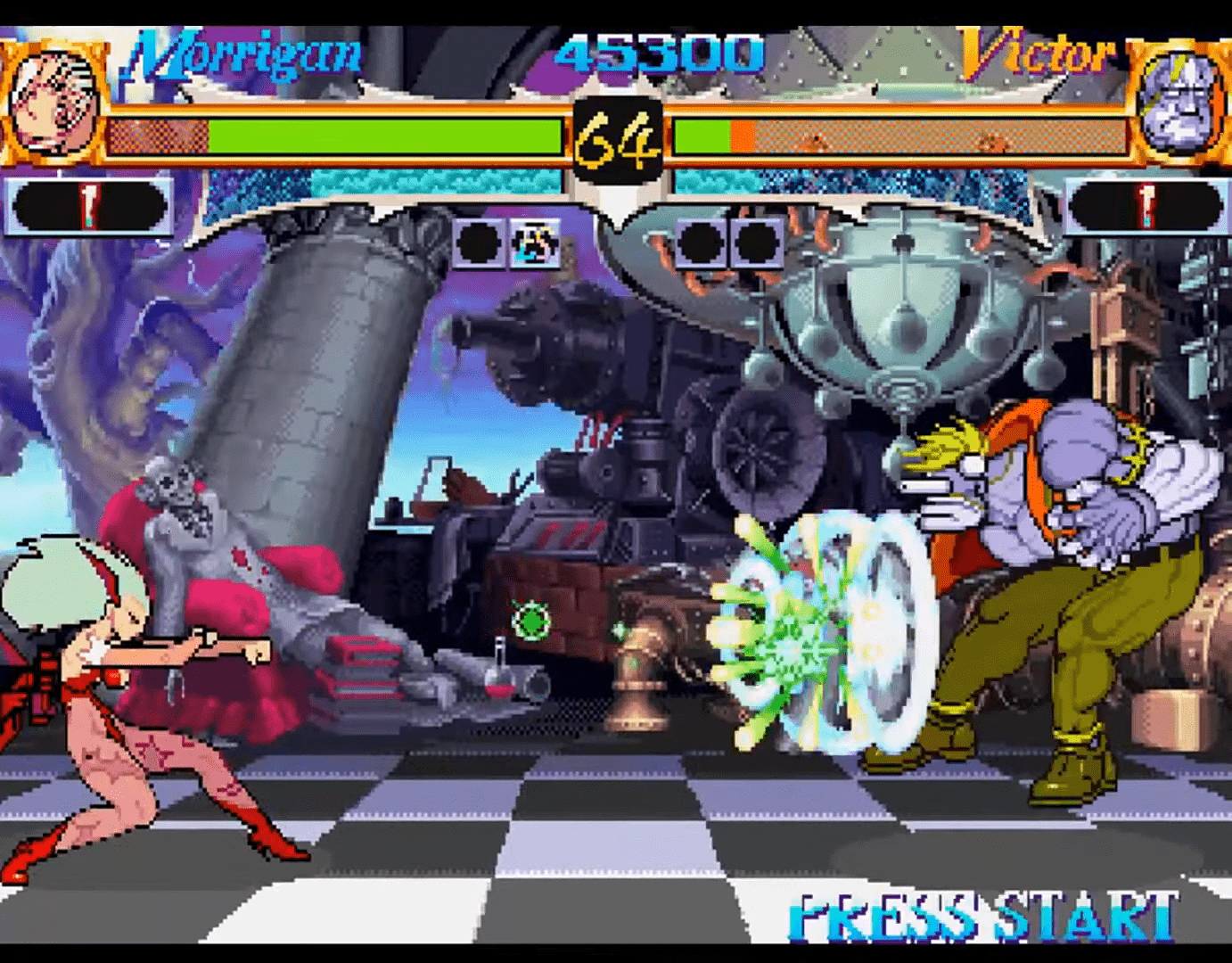
No system can survive without games, and the 32X actually had an impressive selection of launch titles – Doom, Virtua Racing, Star Wars Arcade, Mortal Kombat II… But it was Darkstalkers that really sold me on the system. The game had quickly become a favorite of mine, so knowing it was getting a home port, so soon after its arcade debut… I had to have it!
Unfortunately for me, Darkstalkers for the 32X ended up being vaporware. Capcom had quietly cancelled it after it became clear that the 32X was a flop.
Just how badly the 32X bombed can’t be overstated. The addon made its U.S. debut on Novermber 21, 1994, just in time for the Christmas shopping season. Just ten months later, the price was slashed from $150 to $99, and in early 1996 Sega of America had officially retired the system.
I can only imagine what the immediate response to the 32X might’ve been, if today’s internet had been a thing in 1994. While I might’ve still asked my parents for a 32X for Christmas, I might’ve found out about its failure and the cancellation of Darkstalkers much sooner. Instead, I spent the next year hoping to see or hear any updates on Darkstalkers 32X in Electronic Gaming Monthly and Game Fan Magazine, only to find the 32X coverage dwindling.
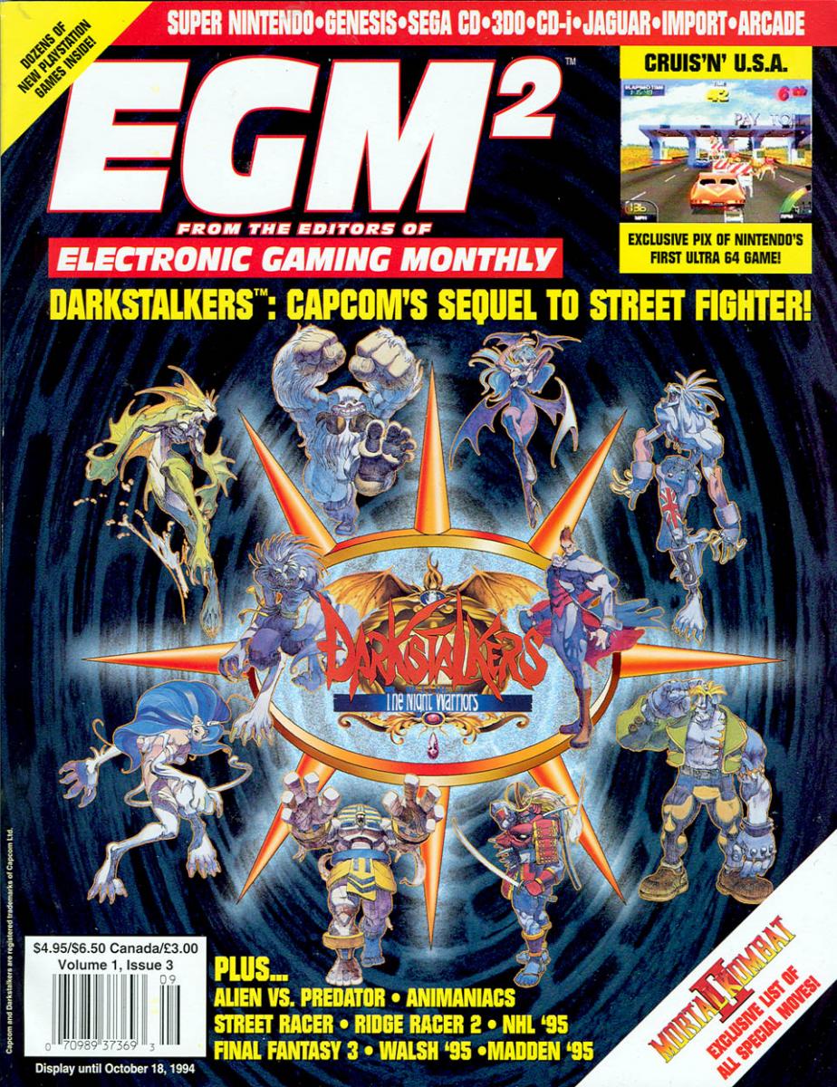
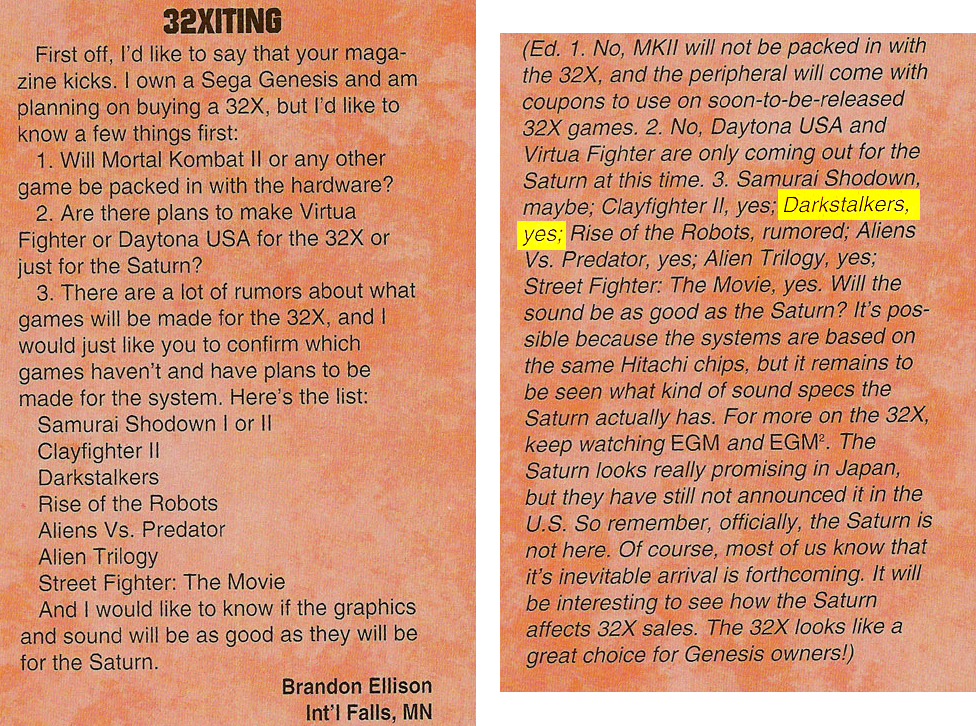
When I sat down to write this post, I wanted to include that Darkstalkers 32X announcement. I know I had read it in either EGM or Game Fan, but finding it now has proven difficult. The closest I’ve been able to find is this exchange from the letters page of the November ’94 issue of EGM2 –
Mortal Kombat II on 32X was another disappointment, at least in the long run. While it had arrived three months after the SNES and Genesis versions, that might not have mattered, as I would have had to wait until Christmas regardless. What was disappointing about it was that it wasn’t any more impressive than the SNES version. It certainly looked and sounded better than the Genesis version, but I’d expected a 32-bit port to be arcade-perfect in every sense.
Many years later, I would find out that the 32X port of Mortal Kombat II was even more disappointing than I’d originally thought. On closer inspection, the graphics – mainly the backgrounds – were less detailed than those of the SNES version. This might have been due to many 32X games using the base Genesis hardware to render background layers, while the 32X itself handled the characters and foreground elements.
I might’ve been far more disappointed in the 32X at the time, if my life hadn’t been taking its own twists and turns. I’d started my freshman year of high school in the fall of 1994, and had a part-time job. By the end of the school year, I lost my job, got another, and had started saving to buy a Saturn AND my first car. I guess it’s no wonder I’d never noticed the 32X’s demise.
I can’t talk (at length) about SF2 and its many editions, without also covering the Capcom fighters that were basically SF2 in disguise – Darkstalkers, Marvel Super Heroes, Street Fighter Alpha, X-Men vs Street Fighter, Marvel vs Capcom… I played the hell out of all of them. Compared to the rest of the Street Fighter II timeline, 1995-1997 were some pretty busy years for fans of Capcom fighters –
1991
February 15 – Street Fighter II (arcade)
1992
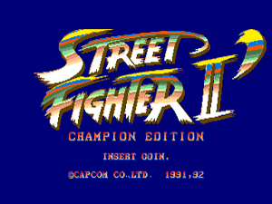
March – Street Fighter II: Champion Edition (arcade)
July 15 – Street Fighter II (SNES)
December 21 – Street Fighter II: Hyper Fighting (arcade)
1993
August 1 – Street Fighter II Turbo (SNES)
September 11 – Super Street Fighter II (arcade)
September 28 – Street Fighter II: Special Champion Edition (Sega Genesis)
1994
February 23 – Super Street Fighter II Turbo (arcade)
July – Darkstalkers (arcade)
July 18 – Super Street Fighter II (SNES/Genesis)
1995
January 5 – X-men: Children of the Atom (arcade)
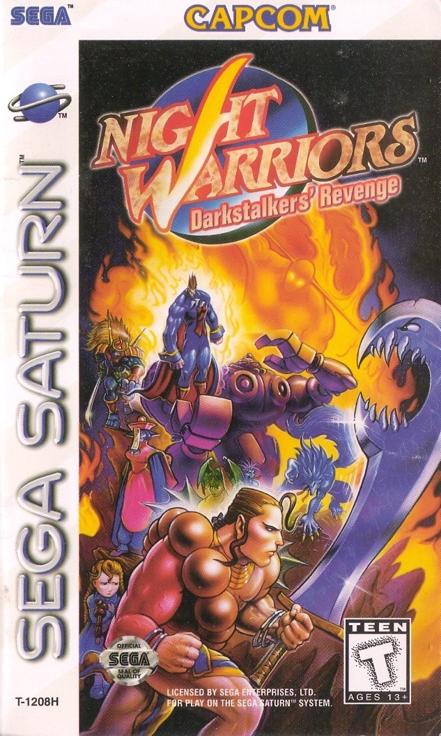
April 6 – Night Warriors: Darkstalkers’ Revenge (arcade)
June 27 – Street Fighter Alpha (arcade)
October 24 – Marvel Super Heroes (arcade)
1996
February 22 – Night Warriors (Saturn)
March 6 – Street Fighter Alpha 2 (arcade)
April 6 – X-Men: Children of the Atom (Saturn)
June 6 – Street Fighter Alpha (Saturn)
September – X-Men vs Street Fighter (arcade)
November – Street Fighter Alpha 2 (Saturn)
1997
March – Street Fighter III (arcade)
March 28 – CyberBots (Saturn)
August 8 – Marvel Super Heroes (Saturn)
August 27 – Marvel Super Heroes vs Street Fighter (arcade)
September 30 – Street Fighter III: Double Impact (arcade)
November 27 – X-Men vs Street Fighter (Saturn)
1998
January 23 – Marvel vs Capcom (arcade)
October 22 – Marvel Super Heroes vs Street Fighter (Saturn)
1999 – Street Fighter III: Third Strike (arcade)
2000 – Marvel vs Capcom 2 (Dreamcast)
Released just a few months after Super Street Fighter II Turbo, Darkstalkers might’ve been my favorite out of the Capcom’s many Street Fighter re-skins. In terms of gameplay, Darkstalkers didn’t re-invent the wheel at all – if you played Street Fighter II, you could jump right into Darkstalkers. The main draw to Darkstalkers was its entirely new cast of characters, largely inspired by classic movie monsters, rendered with colorful, highly-animated sprites. Perhaps because its gameplay was nearly identical to SF2 – and because SSF2T was still a major draw – my local arcade never gave it a prime position. While the likes of SSF2T and Mortal Kombat II enjoyed spacious areas near the middle/front of the arcade, Darkstalkers was tucked into the back corner, where it would mostly only be noticed by kids like me who didn’t have time to wait for their turn to play (and be beaten at) the more popular fighting games.
Darkstalkers was even one of my primary reasons for wanting a Sega 32X when it was announced, because Capcom was reportedly working on a port. That port never materialized, and the 32X ended up being one of the biggest disappointments in gaming history, to put it mildly.
Several months after Darkstalkers, in January of 1995, X-Men: Children of the Atom was released in arcades. Like Darkstalkers, the game featured highly animated, brightly-colored sprites that suited the comic book characters very well. That the X-Men animated series was still running at the time likely helped the game, as well.
Unlike Darkstalkers, X-Men used Street Figher II’s gameplay more as a template. It still felt like SF2, but it added super jumps and air-combos, and the stages were HUGE.
At this point, I’m not sure where I first saw X-Men COTA in action. My local arcade never had it. I only remember being disappointed by the game, because by that point other, faster entries were available. X-Men just felt clunky. It’s entirely possibly I hadn’t played it in the arcade at all, but instead rented it for the Sega Saturn once that version was available. By then Marvel Super Heroes had already been in arcades, and I probably thought that X-Men was the next best thing at home.
In the summer of 1995, I turned 16, and got my driver’s license. That new level of freedom meant that I could hang out with my friends – who all lived miles away – outside of school, and I could visit the mall – and its arcade – almost any time I’d wanted. The only problem was that by then, the arcade at the mall had closed. Luckily one of my friends knew of another arcade not far from there, which became one of our regular haunts. The first time we went there, Marvel Super Heroes was the latest & greatest fighter on the market, and it was a sight to behold – rather than a standard CRT, the game used a large rear-projection screen, with the controls placed a few feet in front of it.
MSH attracted a crowd and dominated the immediate area, to say the least. With faster & tighter gameplay than X-Men: COTA, plus the randomness the use of the Infinity Gems added, players would compete to see who could knock out the most devastating air-combos… and we would all have our asses handed to us by The Pro, whenever he was there.
That might’ve been how I played Street Fighter Alpha for the first time – its machine was against the wall not far from MSH, but it never drew a crowd like MSH did. That meant I could play it without waiting in line, and I didn’t need to risk being swiftly defeated by The Pro.
Night Warriors on the Sega Saturn was something special, not just because it was one of my favorite games, but for what it represented – up to that point, home ports were always downgrades from the original arcade games. Smaller sprites, less animation, fewer colors, worse sound, fewer things moving on the screen… You always had to accept something that was “close enough”, no matter how much it paled in comparison to the arcade. That is, until Night Warriors.
The home version of Night Warriors was pretty much perfect. It looked, sounded, and played like the arcade game. Not “close enough” – it was spot-on. Reviewers for Electronic Gaming Monthly and Game Fan would point out that the characters had fewer frames of animation – unless two players chose the same character – but I can’t say that it was noticeable. As far as I was concerned, the game was a flawless port.
The Saturn was the system to have, if you were into 2D fighting games. Street Fighter Alpha 1 & 2 were again perfect ports. X-Men: Children of the Atom felt clunky, mainly due to its slower gameplay. If you had a sharp eye, you might’ve even noticed the missing animation frames on each character. Marvel Super Heroes was another perfect port, with the use of an optional memory expansion cartridge. X-Men vs Street Fighter required an 8 MB expansion cart, but if you were a fan you’d happily pay the extra price to have an arcade-perfect port at home. 2D fighters were perhaps the one area where the Saturn blew the Sony Playstation out of the water.
…of course, by the time X-Men vs Street Fighter was released, if you wanted the game you had to import it from Japan. Even before then, you had to import most of the Saturn’s good games. The system was such a flop in North America, the game publishers just didn’t see any point in translating and releasing titles.
The home version of X-Men vs Street Fighter also felt like a nail in the coffin for arcades… New arcade games in general weren’t being released as frequently as they had before, likely due to the growth of the home market with the Playstation. Crowds at the arcade were also getting fewer. Not to mention, but that point the amount of time between the arcade and home releases was getting short and shorter.
In hindsight, it seems fitting – poetic, even? – that the age of the video arcade happened to end around the same time that I reached adulthood.
I started college in the fall of 1998, and from that point forward, I had little time to venture out to find an new arcade. I was in a new city, and many of my classmates weren’t from the area, either. The school did have a Marvel vs Capcom machine and perhaps one other game in its student lounge, and that was about the extent of my arcade gaming for the next couple of years. MvC hardly ever went unplayed – we were all nerds, geeks, and gamers, after all – but playing it between classes just wasn’t the same compared to having hours to waste at the mall.
Something that was equal parts depressing and exciting, was a chance encounter with an arcade owner at a shopping center near my apartment, shortly before I’d graduated college. He and an employee were unloading a new machine from a truck, while I was grocery shopping. Out of curiosity, I asked if they happened to sell older games. The manager/owner didn’t hesitate to ask what I was looking for. When I said “something like Street Fighter II”, he told me to follow him.
The storage area behind the arcade dwarfed the arcade itself, and it was so packed with games that it was difficult to navigate. In the middle of all of those machines, was Street Fighter II: Hyper Fighting. It was exactly what I was looking for! And for just $250, they offered to replace the screen and deliver it to my apartment!
At some point between graduation and landing a job, I would convert that SF2 machine into a M.A.M.E. cabinet that could play far more games. After landing a job, moving the cabinet into my new apartment wasn’t much fun, as I was on the second floor. There, it mostly just took up space in a corner. Moving it out a couple of years later was worse. For the next 10 years or more, it collected dust in my parents’ garage. I’d finally gotten around to selling it when they decided to put their house on the market, because moving that cabinet anywhere else just to have it collect more dust sounded insane.
Now, I look at the half-sized cabinets from Arcade 1-Up, and smile, but I would never consider buying one. Apart from the cabinets being too small, and space being a commodity, I think having an arcade cabinet now would be a depressing reminder of a time and place that is long gone. The feel of the arcade – the variety of games, the mixture of sounds, the social aspect – just can’t be duplicated at home. Just thinking about it makes my heart ache…
Sometimes I wonder if any other game has had as big an impact on me, than Street Fighter II. It seemed that no matter how many times Capcom revised, re-imagined, or re-skinned the game, or branched out into other media, I couldn’t get enough.
SF2 was a game I’d gotten hooked on well before I’d ever played it. Seeing the graphics and variety of characters in Electronic Gamic Monthly and other magazines, it was certainly a game I’d play if given then chance. I was 11 years old when it debuted, and the only arcade I was able to visit with any sort of frequency was at the Summit Place Mall in Pontiac, MI.
I don’t think I’d even seen a SF2 machine in person – much less played it – until the Champion Edition was released. It was 1992, and my 6th grade class took a week-long field trip to Toronto, Canada. One of the first places we’d visited was the CN tower, and one of my main takeaways from the whole experience was being able to play SF2:CE for the first time in the arcade at the tower’s base. It was everything I’d hoped it would be, and more. And of course I got my ass kicked, because while I’d read up on the moves and combos extensively, I had no idea how to actually perform them.
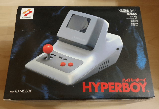
A day or two later in the Toronto trip, we all had a free day to explore the city. My then-best-friend and I came across a game shop that, to me, might as well have been Candyland. It wasn’t the biggest game store I’d ever been to, but it was the most well-stocked that I’d seen up to that point. No space was wasted. They even had accessories I’d never seen anywhere but in the ads in the back of EGM, like the Hyperboy Gameboy mini-arcade mount… thing.
What stood out the most at that store, though, was SF2:CE hooked up to a TV in the front of the store, via a Supergun Jamma harness, another thing I’d only read about in EGM. And for $20, my friend and I could play the game with unlimited continues for 30 minutes. My mom wasn’t too thrilled about that – either the price or having to stand there for 30 minutes while we played – but we had fun.
My last SF2-related memory from that trip might’ve been the day we’d left. We were at a bus station early in the morning, just in time for the arcade there to open. We had time to kill, and whether the manager did it intentionally or if it was just a standard power-on thing, all the games were free to play for the first 10 minutes or so. This arcade didn’t have SF2, but it did have plain old Street Fighter, which surely would be almost as good, right?
…yeah, no. It sucked.
When SF2 was released for the Super Nintendo later in 1992, I was ecstatic. Yeah, it was a little disappointing that it wasn’t the Champion Edition, but it was still Street Fighter II, and I could play it as much as I wanted. And by this point the arcade at Summit Place had a Champion Edition machine, which I’d also play whenever I had the chance.
SF2:CE always drew a fairly large crowd, at the mall. If you wanted to play, you’d put your quarter up at the bottom of the screen, and wait your turn. Unless this one guy was playing. The Pro. An Asian-American dude with hair that went down to his hips. I don’t know if he played SF2 on a tournament level – if that was even a thing, at the time – but he did know all the moves and combos, and was pretty much unbeatable. But everyone wanted the momentary bragging rights that’d come from defeating him, so we all lined up our quarters on that machine, and we all lost, every time.
The only time I’d get to play SF2:CE on any sort of equal footing, was after Mortal Kombat was released later that year. The Pro moved on to that game along with everyone else, and he kicked wholesale ass at that one as well.
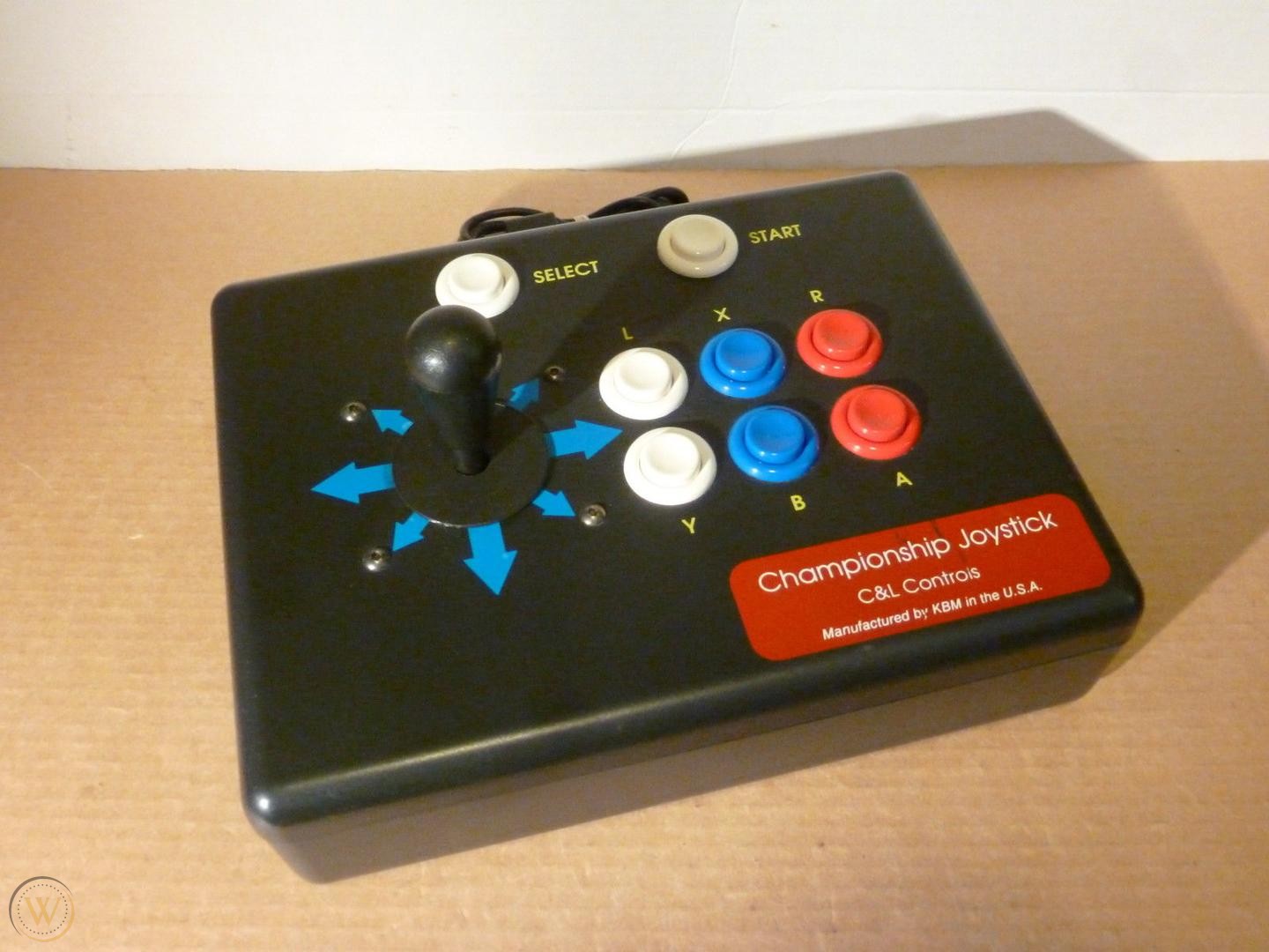
Christmas of ’92 may have been one of the biggest for me, in terms of gaming. My parents had gotten me a Sega CD, Night Trap, Sonic 2… and a Championship Joystick for the SNES. The funny part about the joystick is how much of a surprise it was, after everyone had unwrapped their gifts and cleaned up. I’d gone back to my room to hook up the Sega CD and take it for a spin, when my dad came back to ask what I thought about the controller. I was confused, and had to ask “what controller?”
My parents owned a small business in Union Lake, MI. The building had a storage room in the back, where they would store my & my brothers Christmas gifts. But because it also had a fair amount of the shop’s inventory, it might’ve been easy for some things to get overlooked. That’s what had happened on this particular Christmas – while loading up the gifts the night before, one got left behind – the joystick.
When my dad realized that the joystick had been left behind, he got in his truck and went back to the shop. 20 minutes later, I had a surprise gift to unwrap!
Having that joystick felt like leveling up – it felt like the arcade controls, because it used arcade parts. It made the home version of SF2 feel that much closer to its bigger counterpart.
Another stand-out SF2 experience might’ve been in the summer of ’93, at a weekend car show my dad was attending in North Carolina. The show was between the hotel and a mall – the Four Seasons Town Centre – and where there was a mall, odds are there’d be an arcade. And indeed there was, right near the entrance!
This arcade had a rainbow edition of SF2:CE. I didn’t know that mod chips and bootlegs were a thing at the time, but I could tell that something about this game was different, just from the title screen. The game itself was pretty nuts – projectile speeds, depending on the button you pressed, were either so fast that your opponent would have little time to react, or so slow that you could walk up behind your own fireball. Projectiles could also move diagonally, nearly every move could be performed in the air, and you could change your character by hitting your start button. It was wild.
Another great thing about visiting new arcades, was the chance to see and play games that your usual ones didn’t have. Apart from SF2:CE Rainbow, this arcade also had World Heroes 2, and Martial Champion. While World Heroes 2 was definitely the better of those two by far, Martial Champion stood out because of its large character sprites. I felt it was a shame that the only home port was exclusive to the PC Engine CD, in Japan.
One more thing that made that weekend special, to me – Coca-Cola in 16 oz. cans. Today I look at normal 12 oz. cans as being too much, but as a sugar-addicted adolescent, having that much more Coke in one serving was one of the best things ever.
Piracy and unofficial enhancements to SF2 apparently were so rampant, Capcom had to do whatever they could to compete. Several months after Champion Edition and the SNES release of SF2, SF2: Hyper Fighting was released. Playing it at the arcade – when The Pro wasn’t there, drawing a crowd – made it difficult to go back to the home edition, which felt so slow by comparison.
The home edition of Street Fighter II Turbo would arrive several months later, in August of ’93. Just in time for my birthday! And then just one month later, Super Street Fighter II would land in arcades. By that point it was starting to feel as if Capcom was taunting me specifically.
Speed-wise, Super SF2 felt like a downgrade, but the new characters, moves, and combos were the big draw. I also thought it was funny that Guile’s voice was now the same as the announcer’s, which wasn’t very masculine.
September of ’93 also saw the release of the Special Champion Edition for the Sega Genesis/Mega Drive. At the time I thought it was a joke that the Genesis was a version behind the SNES, not realizing that the Genesis version had all of the Turbo features (and then some), just under a different name.
By this point, my familiarity/obsession with SF2 was such that I was picking out the differences between the arcade and home versions. The arcade had more (and smoother) animations, and the sprites were bigger. The Genesis game’s music sounded much closer to the arcade, compared to the SNES. The Genesis voice samples were also closer to the arcade, but sounded worse than the SNES ones at the same time, due to how compressed they were. My friends at the time made fun of me for noticing these things. That certainly hurt at the time, but looking back, I can hardly blame them. Maybe I should have been more interested in music, as they were, except I felt most popular music in ’92-93 sucked.
Summer of 1994 would see the release of Super SF2 on the SNES and Genesis. The SNES version might’ve been the first game I’d purchased with my own money, which also gave me my first taste of buyers’ remorse. The game was as accurate to the arcade as the SNES could get, but the fact that Super SF2 Turbo had been in arcades for several months by this point stung a bit. I felt like I’d paid $80 for an inferior game.
A year later, Super Turbo was released for MS-DOS. I didn’t hesitate to buy it… despite the fact that my family would not own a computer until some months later. And once we did have a computer, the game’s sound wouldn’t work. Graphically it looked exactly like the arcade game, but the lack of any sound robbed it of its impact. By that point, Street Fighter II had been my #1 gaming obsession for 3 years, and showed no signs of stopping…